/
PATH@PENN
/
OVERVIEW
OUTCOME
My redesign focused on student priorities
The updated system improves search and filtering, clarifies course requirements and availability, and introduces new planning tools to help students make confident registration decisions without leaving the platform.
/
RESEARCH

AFFINITY MAP
From there, I found the following key takeaways:
GOALS
Graduation Comes First
I prioritize classes that fulfill graduation requirements, but it is not always clear what fulfills minors and majors.
Students choose classes primarily based on what fulfills their degree, major, or minor requirements.
They want a system that clearly shows what courses count instead of relying on external tools.
DECISIONS
Attributes, Availability & Difficulty
I have a separate spreadsheet where I plan out all courses because it’s hard to do that in Path@Penn.
The top factors influencing course selection are whether a class meets specific attributes, if it's open, and how hard it is perceived to me.
These details need to be surfaced to help students make informed decisions.
CLARITY
Transparency Builds Trust
Sometimes it’s unclear that you have to apply for certain classes. You think you can register for it but you can’t. If you don't know about the application process via word of mouth, you never find out.
Students want clear visibility into a course status — if permission requests are required or how long the waitlist is.
Transparency allows students to curate their courseload with confidence.
/
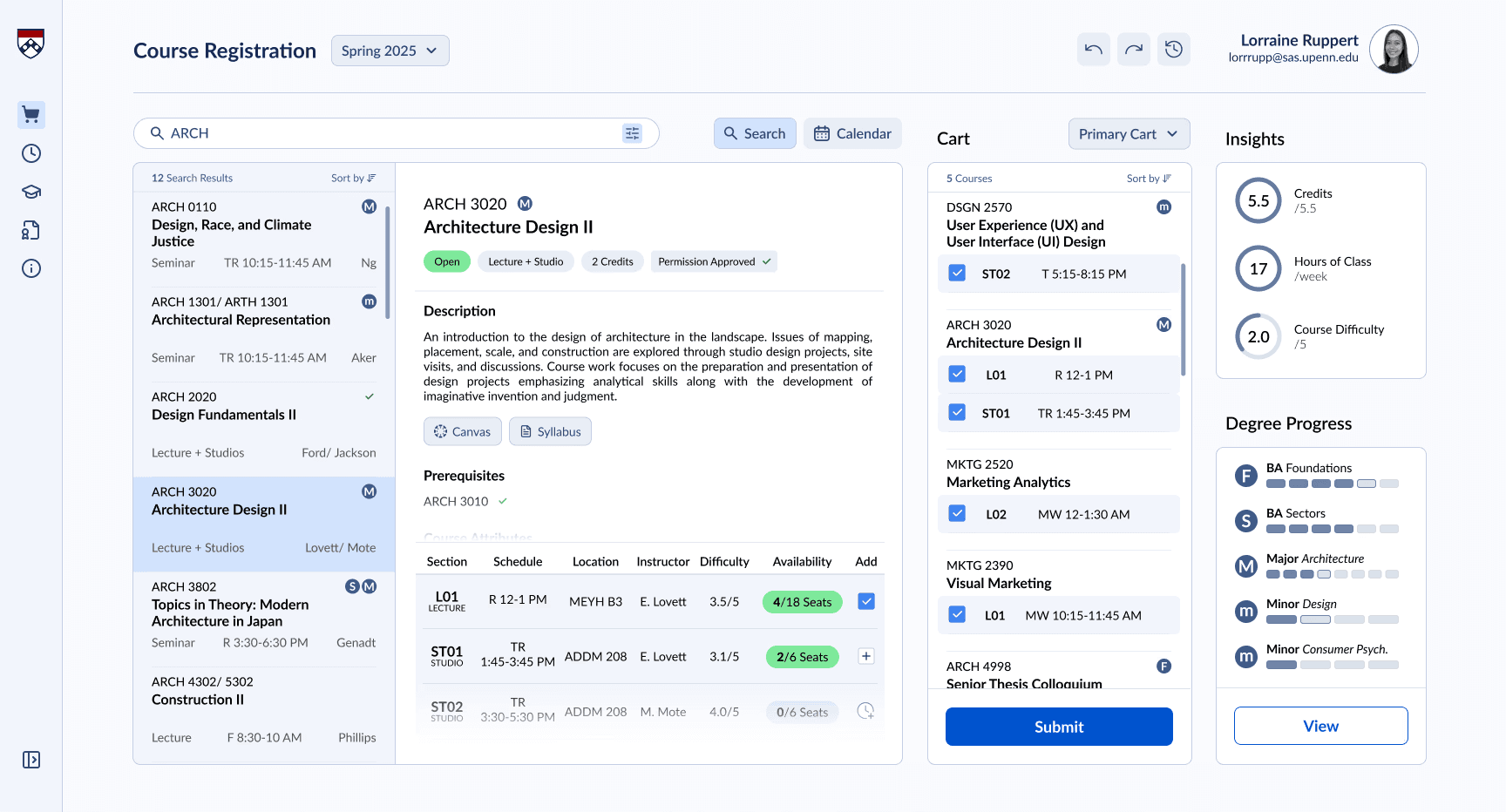
INTERFACE ANATOMY
So, how do these components come together to form the new interface?
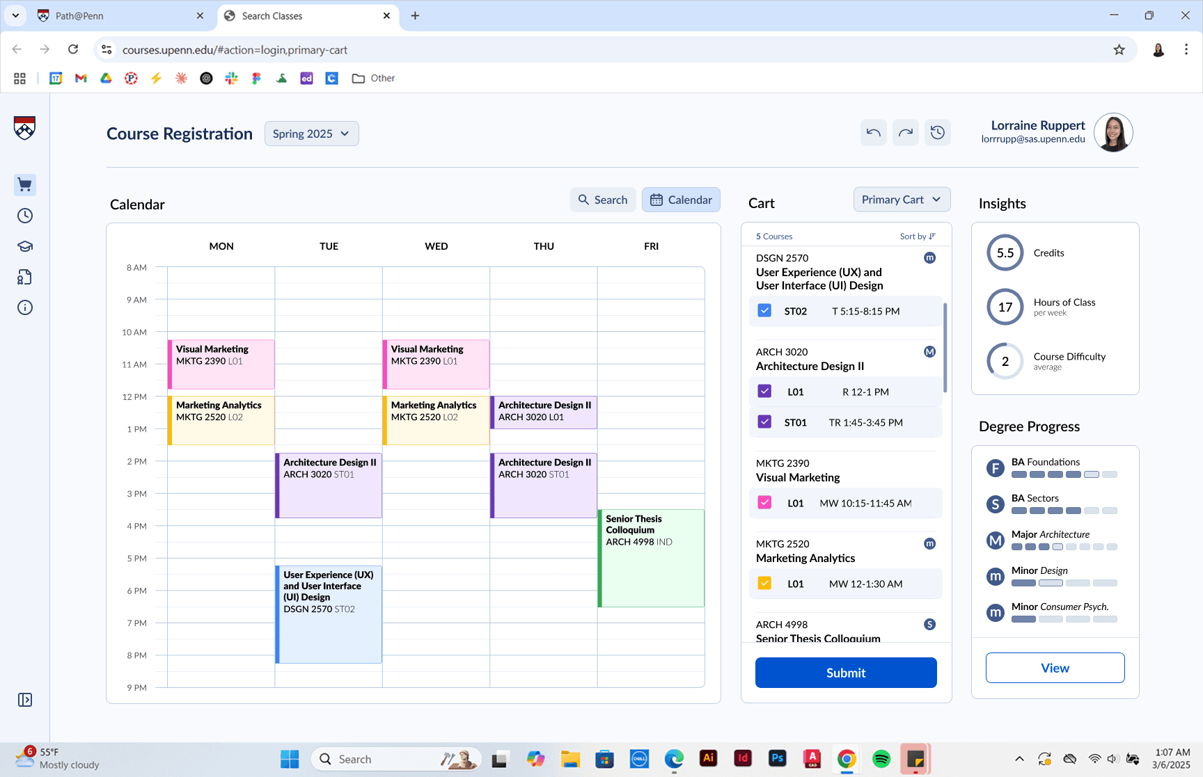
Let's walk through the redesigned UI
Scroll to continue
Search
Scroll to continue
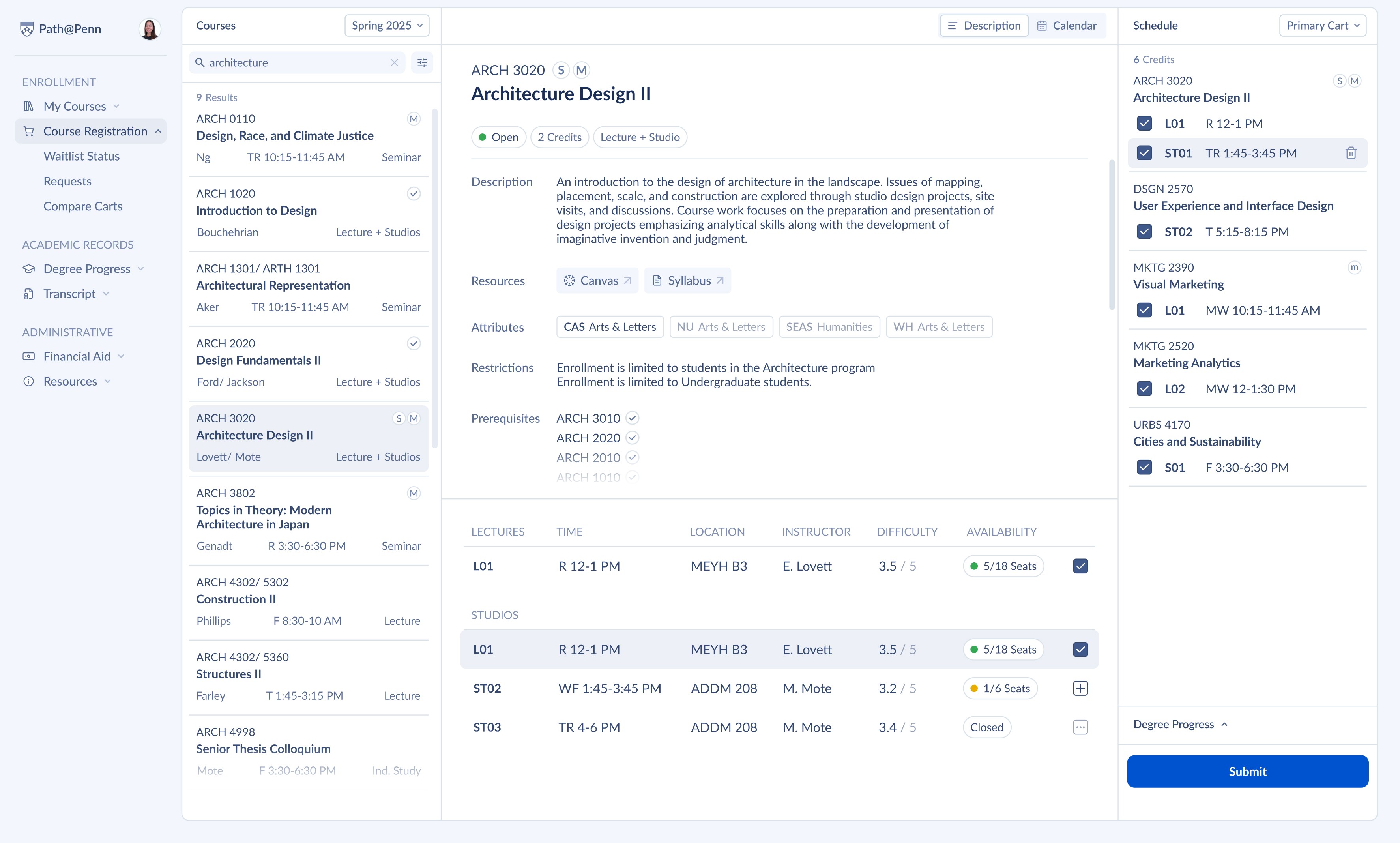
Search Results
Scroll to continue
Course Details
Scroll to continue
Section
Scroll to continue
One-Click Course Adding
Scroll to continue
Cart
Scroll to continue
Insights
Scroll to continue
Progress
Scroll to continue
See insights in action.
Scroll to continue
Calendar Toggle
/
USER FLOWS
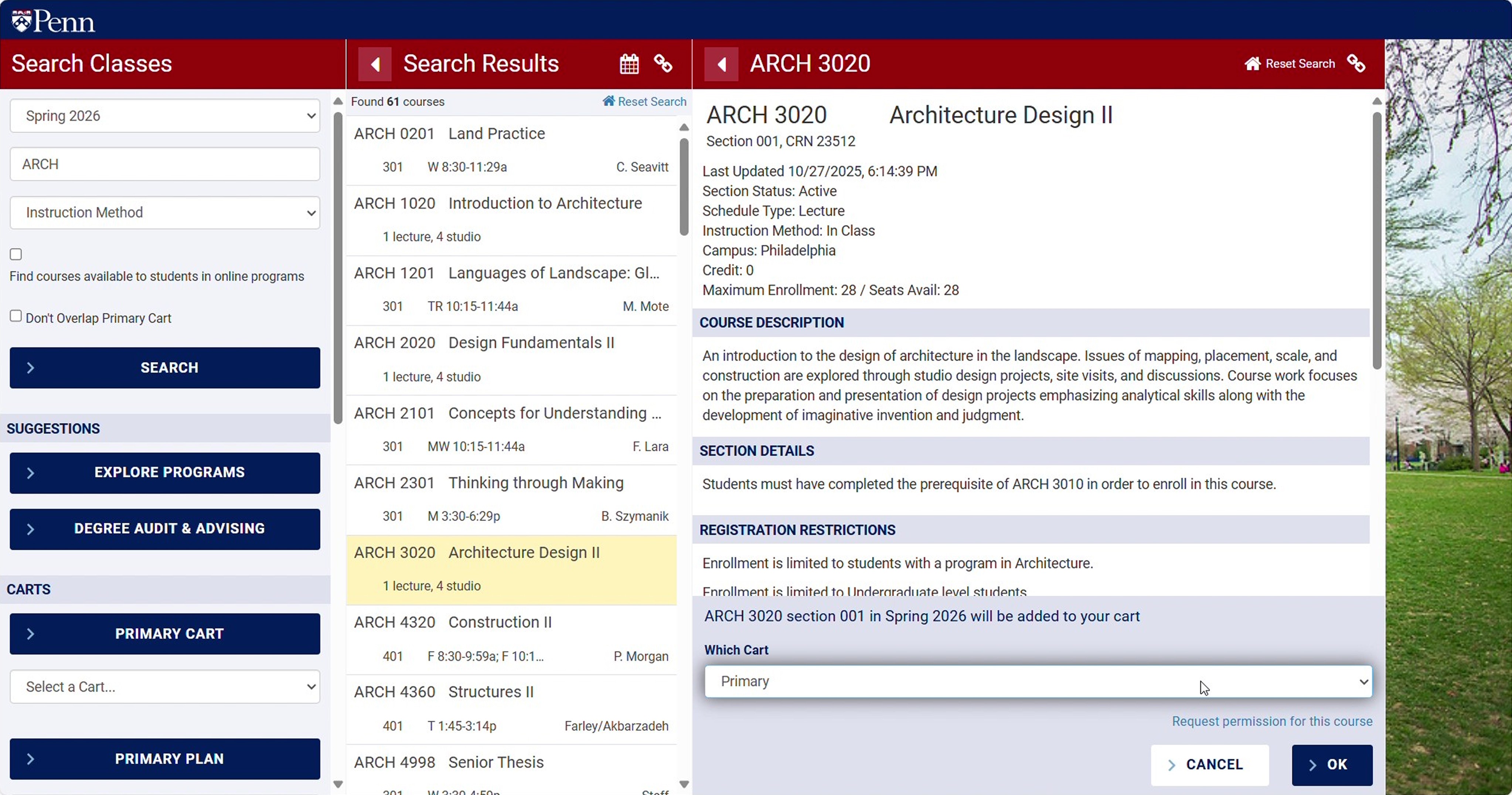
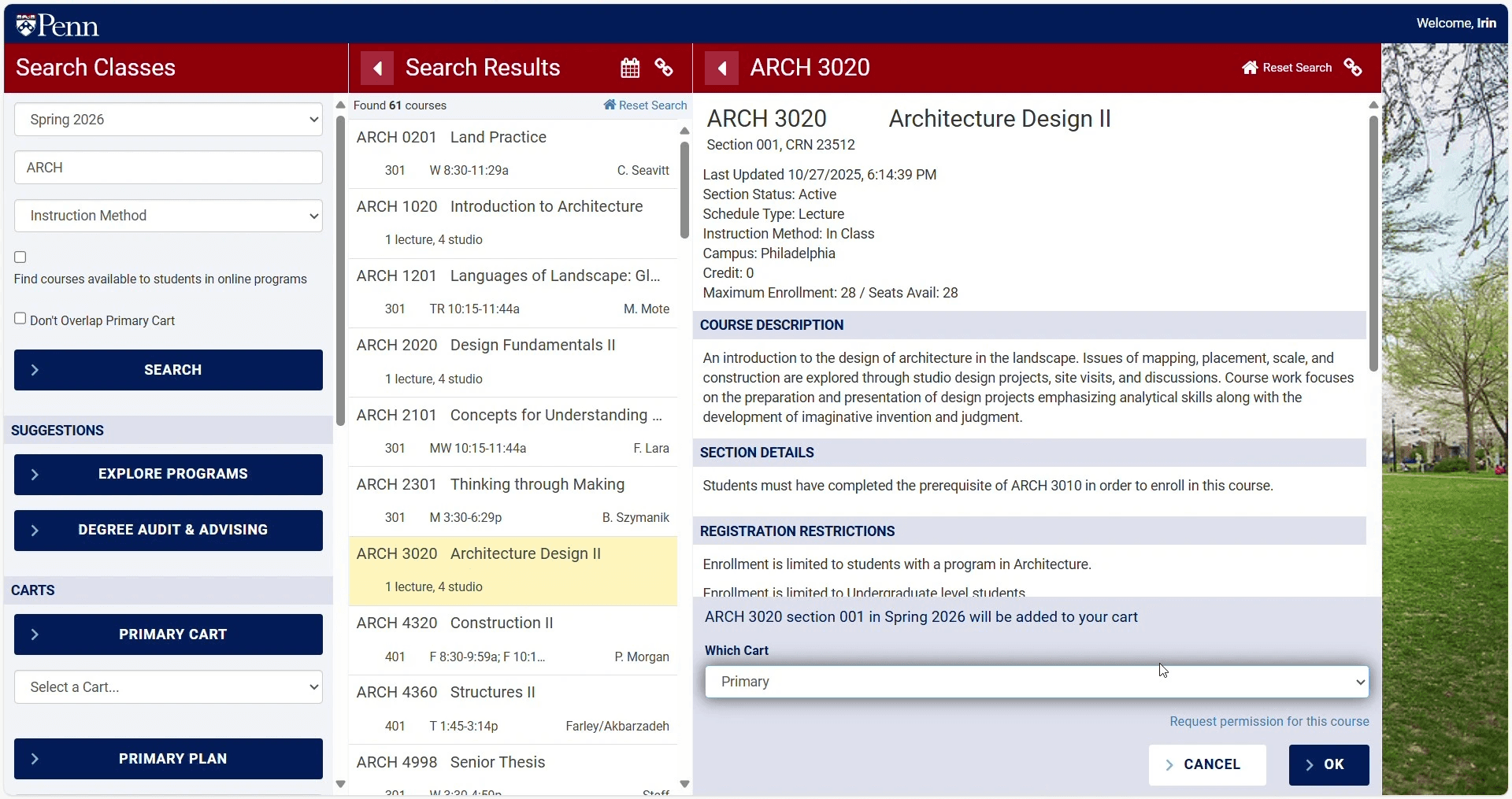
Add a Course + Write Permission Request
Remove a Course
COMPONENTS
Components that make up a system
Brad Frost's Atomic Design, the smaller pieces assemble the larger product. Starting from the smaller details.
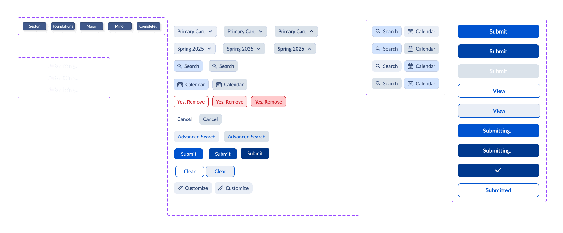
DESIGN SYSTEM
Style Consistency Across Pages
COMPONENTS
Takeaway #1: Graduation Comes First
Brad Frost's Atomic Design, the smaller pieces assemble the larger product. Starting from the smaller details.
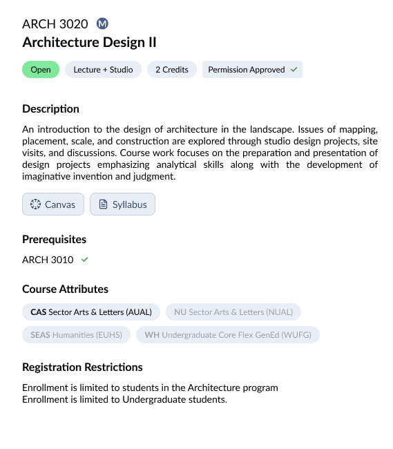
High-Context Course Preview
The previews after a search provide the most relevant course information first.
Progress Tracking
As you build your schedule, see how each course impact your schedule.
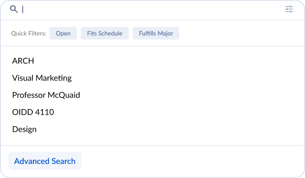
Quick Filters
The previews after a search provide the most relevant course information first.
Visually Differentiated Filters
The previews after a search provide the most relevant course information first.
COMPONENTS
Takeaway #2
Brad Frost's Atomic Design, the smaller pieces assemble the larger product. Starting from the smaller details.
Tooltip
Tooltips labels are activated by hovering over a component to communicates an icon's function.

Color-Coordinated Calendar
See what course corresponds with its calendar view with color coordination
COMPONENTS
Takeaway #3
Brad Frost's Atomic Design, the smaller pieces assemble the larger product. Starting from the smaller details.
BEFORE & AFTER
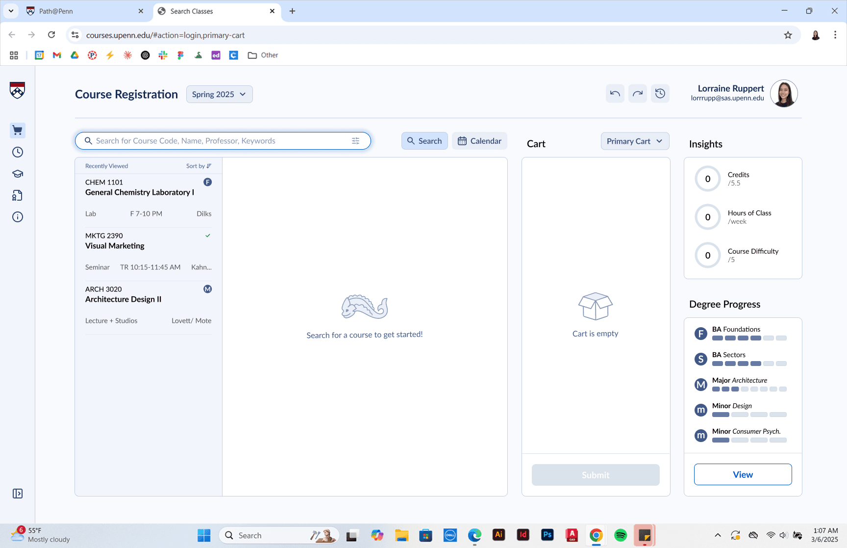
Path@Penn is a powerful tool that overwhelms its users
Path@Penn is essential to every Penn student, but it is dense, unfiltered, and difficult to navigate. This causes students to resort to third-party tools such as Penn Course Plan and Penn Course Review.
ENDLESS SCROLLING
TOGGLE
ENDLESS SCROLLING
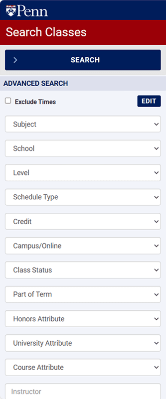
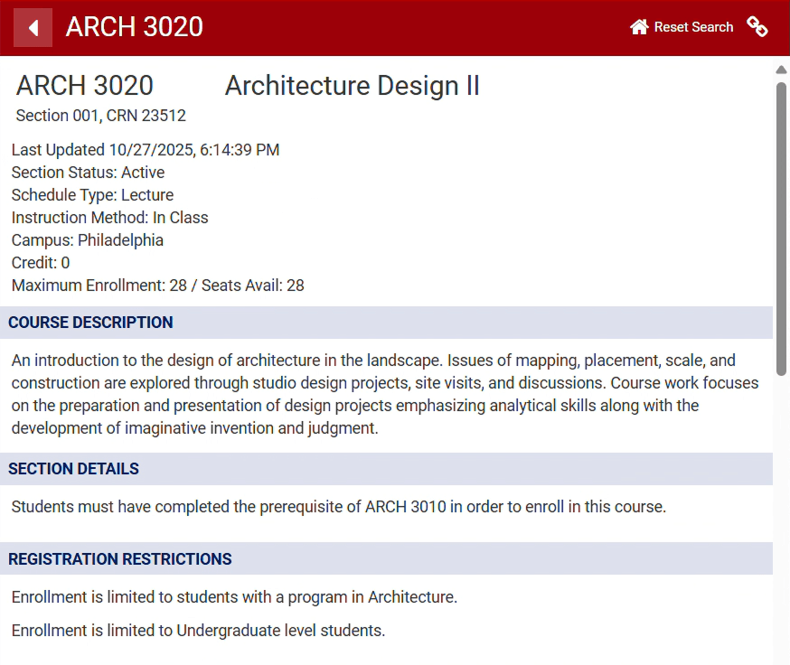
CONFUSING FILTERS
POOR INFORMATION HIERARCHY
ITERATIONS
Style Consistency Across Pages
REFLECTION
STATEMENT
BODY TEXT BODY TEXT BODY TEXT BODY TEXT BODY TEXT BODY TEXT BODY TEXT BODY TEXT
